|Advisement Page
|ClassConnections Page|
Hoover's Scheduled Classes 1998-99|
|Summer Graduate Film Workshop|
|Graduate Programs|
|Hoover's Teacher Resource Site|


(Return to Graph and data Table of Contents Page)
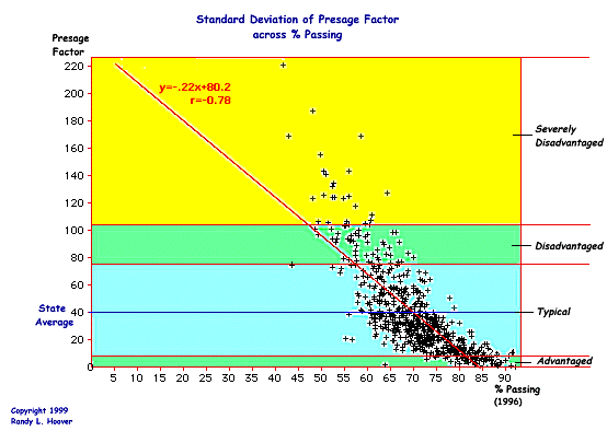
This graph shows the degree and extent of how the Presage Factor plays out across % of students passing the 1996 tests by school districts. This graph is critical in understanding my thesis that: The greater the degree of economic, social, political, and environmental disadvantage as measured by the Presage Factor, the lower the district's passing rate will be. This graph is derived from using the standard deviations within the scale of the Presage Factor to create catagories of districts that are: Advantaged, Typical, Disadvantaged, and Severely Disadvantaged.