|Advisement Page
|ClassConnections Page|
Hoover's Scheduled Classes|
|Summer Graduate Film Workshop|
|Graduate Programs|
|Hoover's Teacher Resource Site|


(Return to Graph Table of Contents Page)
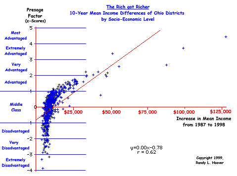
10-Year Mean Income Differences Across Ohio Districts
This graph could be called "Visual Results of the George Bush Recession" because it exemplifies how income increased dramatically for the upper classes as a result of the redistribution of wealth that resulted from the Trickle-Down Economics of the Reagan-Bush years. The Bush era was the culmination of neo-conservative economic policies that brought us the first recession in American history in which the middle and underclass suffered from underemployment and loss of benefits while at the same time the stock market soared to new heights as the upper classes of the advantaged profited hugely.
The graph below was an accidental by-product of the OPT/OSRC research study that was discovered as I was looking at mean district income and its relationship to test performance. It shows clearly how the upper classes have benefited from the legacy of Reaganomics by keeping the less advantaged from access to the vast wealth of this nation. It is important for educators to realize that the same political ideologues that brought us the new poor also brought us state proficiency testing and open disdain for all those connected with public teaching and public schooling.
Specifically, the y-axis represents districts according to degree social-economic-environmental advantage/disadvantage. The y-axis represents the increase in mean wealth across the ten-year period. Although the correlation coefficient and regression line are given, it must be noted that the r=0.62 greatly underestimates the degree of association between the two variables. This is because the relationship is clearly curvilinear and therefore the linear analysis underestimates association.
(To see the graph with some of the districts identified, click HERE.)


