|Advisement Page
|ClassConnections Page|
Hoover's Scheduled Classes|
|Summer Graduate Film Workshop|
|Graduate Programs|
|Hoover's Teacher Resource Site|


(Return to Graph Table of Contents Page)
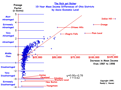
10-Year Mean Income Differences Across Ohio Districts: Notated
The y-axis represents districts according to degree social-economic-environmental advantage/disadvantage. The y-axis represents the increase in mean wealth across the ten-year period. Although the correlation coefficient and regression line are given, it must be noted that the r=0.62 greatly underestimates the degree of association between the two variables. This is because the relationship is clearly curvilinear and therefore the linear analysis underestimates association.
(Return to Original Graph.)