 |ClassConnections Start||Commentary on Proficiency Testing||Proficiency Start Page|
|Enquirer Article||Graphs of the Data I||Graphs of Data II||Graphs of Data III|
Graphic Display II
Figure 4:
A Different View
I am somewhat limited in data analysis interpretation from both the standpoint of the Enquirer's methodology and in my own software not allowing me to do highly advanced data analysis on my home computer (not to mention the tremendous amount of time requried to collect, transform, and enter the data). However, even working within the limitations of my software, I have discovered that the effects of income on Ohio Proficiency test scores may be even more severe than what my own regression analyses show and far more than the Enquirer shows.
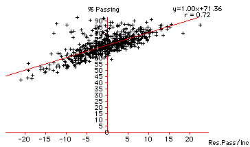
Figure 4 shows that there is slightely more of a curvilinear relationship between family income and proficiency test scores than there appears to be just looking at the basic data. The graph shows a particular aspect of what is shown in Figure 3: Percent Passing compared with Median Income. Figure 4 graphs the residuals of the regression line found in Figure 3 against the percent of students passing the test. residuals represent how far a given school district is above or below the regression line. The greater the distance above or below the line, the more anomolous is the behavior from what would be expected given the tendencies shown in the data
Figure 4 suggests that higher income districts tended to perform better that would be predicted by the analysis and that lower income districts tended to perform even worse that what would be predicted. However, these predictions are based upon the idea of a linear relationship, one that distorts the effects of family income on proficiency test performance.
This distortion works to make the poorer districts look more underachieving than than they actually are as income plays out across proficiency test performance. Similarly, it makes wealthier districts seem to perform better than would be expected. Given that there is a rather significant correlation between whether or not a school district scored better or worse than expected and the income of those districts, claims against the poorer districts that they are performing even below what would be statistically expected are more than likely based upon use of an inappropriate form of statistical analysis. Put in other terms, there seems to be a good argument (one that needs to be statistically analyzed further) that family income has an even greater effect than previously thought on proficiency test performance..
The reason the regression line for percent passing across family income seems to be linear is because so many districts in the middle range of income balance out the extremes that appear with the richest and poorest alone. The following graphs support this argument.
Figure 5:
Income Residuals across Rank

Figure 5 is a slightly different version of Figure 4 that more graphically shows the suggested curvilinear relation of family income to the percent passing the test. It shows especially (the extreme lower right quadrant) well the poorest districts falling into the "worse than expected" category. The x-axis in this graph is the rank for the district with 1 being highest and 608 being the lowest. This graph clearly shows (r = -0.71) a very strong correlation between income and residual effects with wealthier familys scoring above what would be expected based upon a linear regresssion analysis and districts with poorer families scoring lower. These data clearly support the hypothesis that income has a curvilinear effect on proficiency test performance. It is extremely important to understand that this idea has tremendous implications for the critique of proficiency tests in general and for helping the educators, students, and parents in the poorer districts stave off the unfounded and unfair criticism by politicians, consultant firms, and anti-public schooling special interest groups.
Figure 6:
Percent Passing across Rank

Figure 6 is an attempt to tease out a visual representation of the curvilinear hypothesis. Using the rankings of each district compared to the percent passsing allows us to finally see clearly a definite curve in the actual data plots existing over the regression line. The graph shows districts ranked near the very top having a much higher rate of passing than the regression line predicts and districts ranked near the bottom having a much lower rate of passing that would be expected. While these data do not tell us why there is a strong effect on both extremes, it does tell us somethings is happening that should be considered very seriously.