|Advisement Page
|ClassConnections Page|
Hoover's Scheduled Classes|
|Summer Graduate Film Workshop|
|Graduate Programs|
|Hoover's Teacher Resource Site|


(Return to Table of Contents Page)
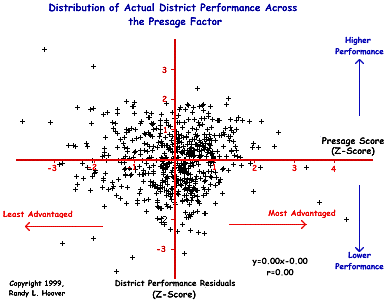
Distribution of Actual District Performance Across Presage Effects
The significance of this particular graph is in its relationship to the power of the Presage Factor as shown in the graph of the primary findings from this study . Simply stated, the graph below represents district performance when we control for Presage Factor effects.
This graph shows that when the district OPT performance residuals (actual performance) from the primary graph are themselves compared to Presage levels, there is no correlation whatsoever. This is one of those rare cases when a low or zero-order correlation is good. What is shown is that actual district performance (performance determined by controlling for Presage Factor effects) is, indeed, free of any and all Presage Factor effects. In other words, this analysis helps verify that we can examine district performance without having to be mislead by Presage Factor effects.
A list of the highest performing Ohio districts based upon the data shown in this graph may be found HERE. Only the top 1/3 are given because I do not wish to have these data used against any Ohio school district performance. Though we are now able to view district performance free of Presage Factor effects, this study does not in anyway wish to imply that OPT should be used as any measure of district, teacher, or pupil accountability whatsoever. In other words, the findings of this study show clearly that the OPT is not a valid measure of either school or teacher effectiveness and should not be used for accountability assessment. Likewise, because the test is invalid (it has now been shown that it does not measure what it claims to measure), individual student performance is at best, meaningless.
- The upper left quadrant represents districts that are performing average or above average and have average or below average levels of advantagement.
- The upper right quadrant represents districts performing average or above average and have average or above average advantagement.
- The lower left quadrant represents districts that are performing average or below average and have average or below average advantagement.
- The lower right quadrant represents districts performing average or below and have average or above average advantagement.
- The greater the distance above or below the x-axis (the horizontal red line), the more the district is performing respectively beyond or below what would be expected given the presage effects of the particular district.
- Districts falling between +1 and -1 on the x-axis are all within one standard deviation of the mean and may be considered as having average performance that is about where we would expect them to perform.
- Any district above the +1 mark above the x-axis is performing significantly better than average and better than would be expected. Likewise, any district below the -1 mark below the x-axis is performing significantly lower than average and lower than would be expected.