(Return to Graph Table of Contents Page)
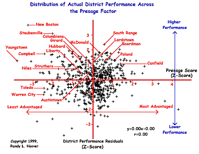
The significance of this particular graph is in its relationship to the power of the Presage Factor as shown in the graph of the primary findings from this study . Simply stated, the graph below represents district performance when we control for Presage Factor effects and it identifies selected districts for use in class discussion and for general information for my graduate students. A more detailed explanation of this particular analysis and of the basis for this graph can be found HERE.
A list of the highest performing Ohio districts based upon the data shown in this graph may be found HERE. Only the top 1/3 are given because I do not wish to have these data used against any Ohio school district performance. Though we are now able to view district performance free of Presage Factor effects, this study does not in anyway wish to imply that OPT should be used as any measure of district, teacher, or pupil accountability whatsoever. In other words, the findings of this study show clearly that the OPT is not a valid measure of either school or teacher effectiveness and should not be used for accountability assessment. Likewise, because the test is invalid (it has now been shown that it does not measure what it claims to measure), individual student performance is at best, meaningless.
- The upper left quadrant represents districts that are performing average or above average and have average or below average levels of advantagement.
- The upper right quadrant represents districts performing average or above average and have average or above average advantagement.
- The lower left quadrant represents districts that are performing average or below average and have average or below average advantagement.
- The lower right quadrant represents districts performing average or below and have average or above average advantagement.
- The greater the distance above or below the x-axis (the horizontal red line), the more the district is performing respectively beyond or below what would be expected given the presage effects of the particular district.
- Districts falling between +1 and -1 on the x-axis are all within one standard deviation of the mean and may be considered as having average performance that is about where we would expect them to perform.
- Any district above the +1 mark above the x-axis is performing significantly better than average and better than would be expected. Youngstown City School District is a very good example of an Ohio district that has above average performance when we control for the effects of disadvantagement (Youngstown has the greatest level of disadvantagement of all the 593 districts studied.)
Similarly, any district below the -1 mark below the x-axis is performing significantly lower than average and lower than would be expected. The unmarked district far right and far down in the lower right quadrant is an example of a very advantaged district that is performing well below average and well below where it would be expected to perform based on the data. It is Indian Hill School District in Hamilton County.